Project Podcast
Skills: Visual Research, Design Thinking, Illustration, Sketching, Brand Identity
Tools: Adobe Illustrator
Timeline: 2025
Overview
A client reached out to me because they were rebranding their freelance production company into a more podcast-focused direction. He asked me to come up with a logo and some basic brand guidelines to help represent the fresh start.
There were a few constraints that the client gave. First, the name would be “Project Podcast” and he wanted it to have a space theme to it. Additionally he loves gradient logos – specifically purple and blue – and wanted to see if that was something that could be incorporated here. Keep these thins in mind, I began research.
Sketching & Mindmapping
Keeping the findings from my research in mind. I took to my notebook to begin the ideation process. I began by doing a mind map relating to anything about the business. After doing this exercise, I took note of the keyword that I felt like could have some direction to them. This took me to my next exercise which was simply putting pen to paper and drawing the items that I noted. This allowed me to mess around with the looks of different items to hopefully come up with a unique idea.
Research
The research phase of this project began with a brief competitive analysis and general logo/icon visual research. One finding was that many competitors leaned into a more retro vibe. This is a positive because it means our more modern futuristic styling should stand out more. Unfortunately the purple and blue coloring that he wanted to go for was used more than a few times with competitors. One challenge to take not of will be differentiating the branding despite a similar color palette.
First Iterations
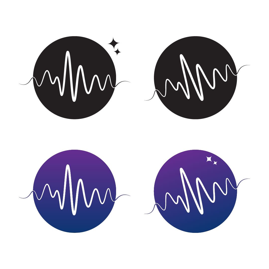
Thanks to my ideation exercises, I had a pretty good idea of a few directions I could go with for this logo. In a fresh Illustrator document, I mocked up 3 icon ideas for the brand. Additionally, I came up with two possible color palettes that played with the blue and purple in a unique way.
After presenting the items below to the client. We came to the conclusion that the first icon is the best direction to head. This was due for a few main reasons:
The audio representation is the most subtle in this one is the most unique. The client also loved that you can still tell that it is meant to loosely resemble Jupiter.
The angle in the icon represents upward growth, which Project Podcast promises to provide for its clients.
The star icon was a great addition that could be used in other branding materials. Unfortunately, as you’ll see later, this did not end up working out.


Revisions
Following the first iterations, it was now time to design the typography to go along with branding. I finalized the color palette – a revised version of option two. We were getting close to finalizing the details on everything, until the client stumbled upon a YouTube video that raised some concerns.
In the video, Imel talks about how his favorite sparkle emoji—which looks very similar to the stars I had designed—has been co-opted as a symbol for artificial intelligence. Originally created as part of the very first emoji set in 1997, the sparkle once represented magic. Later, it was used for emphasis, and even sarcasm. But today, it’s become synonymous with AI.
Somehow, I hadn’t made that connection. But once I saw the video, it became crystal clear. Think about it: Gemini, ChatGPT, Galaxy—all major AI-related brands using star or sparkle imagery. That visual language has shifted.
After some discussion, I ultimately recommended we remove the star from the brand identity. The client felt strongly about not being mistaken for an AI company, and I couldn’t ignore the evolving meaning behind that visual cue. Luckily, this was not the biggest deal and we still had put together a strong brand for Project Podcast.
Conclusion
This full scale branding project allowed me to work closely with a client who had a lot of ideas and visions for what he wanted out of it. Some key takeaways from the project include:
Understand the clients needs beyond what they are simply saying. The client may have a lot of ideas for what they imagine a design to look like. It is your job as a designer to translate those things into the deeper problem that they need to be solved and guide them toward the most effective solution.
Stay current with industry trends. Not knowing the new representation of the four pointed star could have given the brand a very different representation than what they client was looking for. It is crucial that you keep learning and stay aware of modern trends and representations in design.
Iteration is key. This project went through multiple rounds of changes, getting closer each time until it was perfect. It’s not always going to be done on the first try, you have to keep iterating.


